The Government Alliance on Race and Equity (GARE) is a peer-to-peer learning and practice network dedicated to advancing racial equity in government. GARE transforms the everyday mechanics of local and regional governments so that all families and communities thrive.
TOPIC AREAS
Civic Participation
PROJECT TYPES
Digital & Physical Tools
Visual Identity
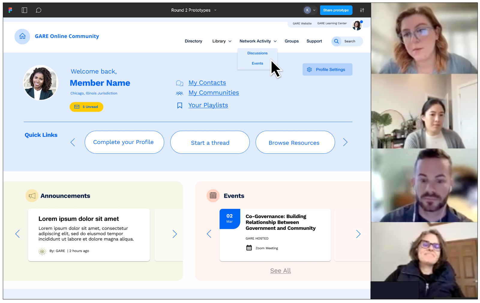
In the wake of the racial justice reckonings of 2020, the Government Alliance on Race and Equity (GARE) experienced a surge in membership and an increased demand for racial equity resources. Through strategic planning, they recognized the opportunity to redesign GARE’s online member portal to better serve as a vital tool for communication, connection, and collaboration among their growing network of racial equity practitioners.
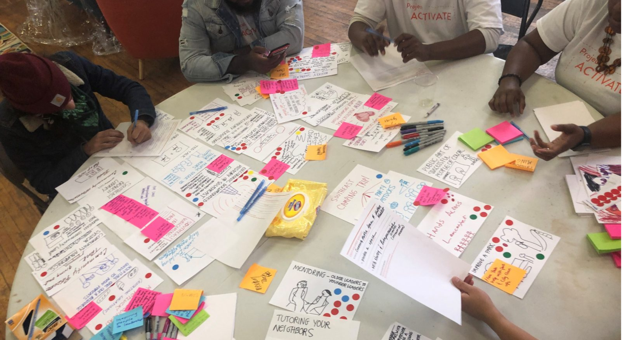
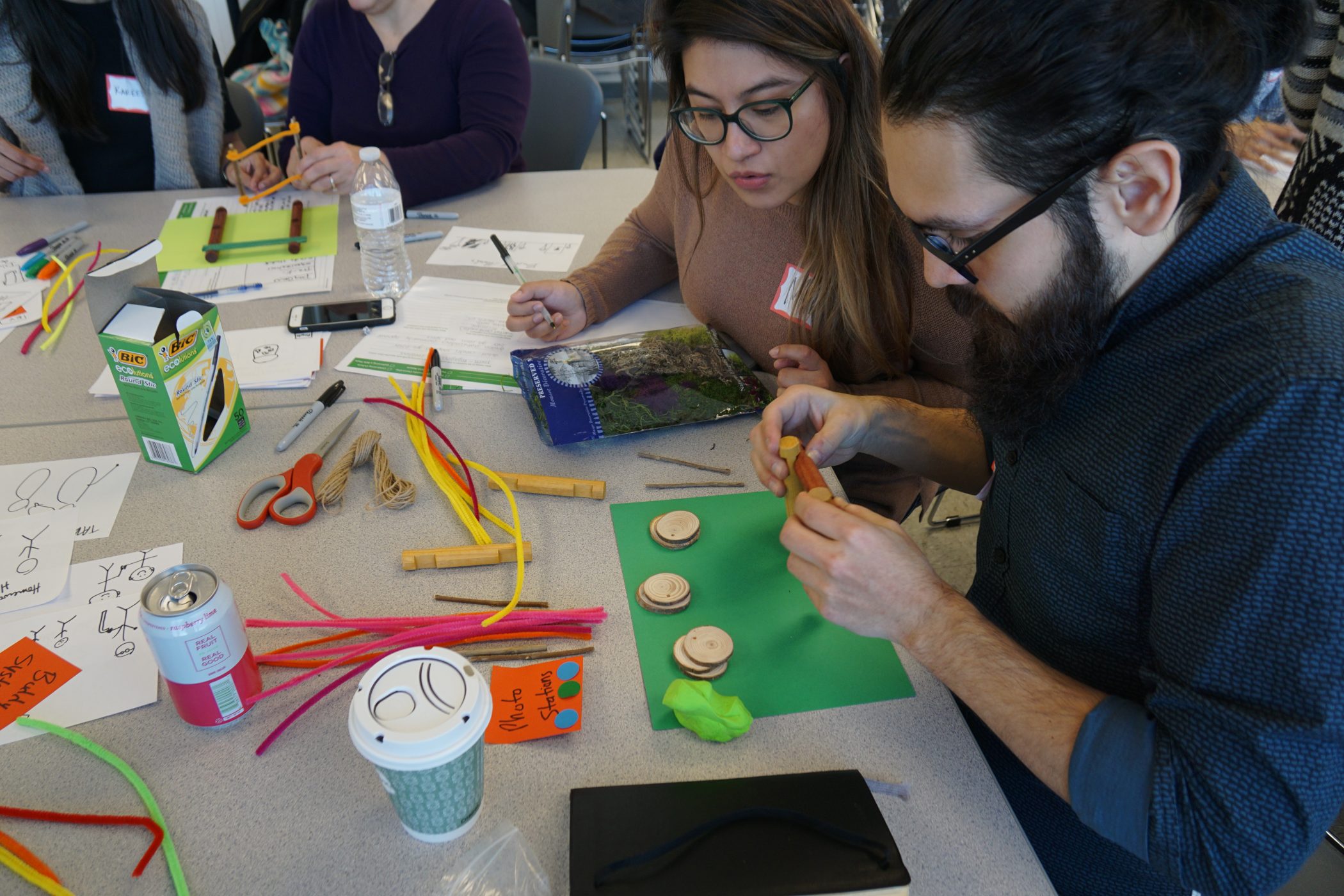
Once the portal redesign was underway, GARE also saw a need to refresh the network’s visual identity and communications, including its logo and website. We worked with GARE over the course of 18 months, helping them to conduct a community-engaged and human-centered design process to redesign these different aspects. The new online experience is one that brings new value to the network, surfaces ongoing insights for GARE, brings fresh energy to the brand, and reflects its vision for a vibrant, just, and multiracial democracy.
Project Outputs
With alignment on a visual identity that reflected the dynamic and transformative nature of GARE’s work in place, we finalized our design deliverables, bringing it all together.
For the online experience, we refined the visual styling for the website and portal user interfaces, and we delivered a final set of annotated page designs, as well as an information architecture and user interface (UI) style guide to support the development build. You can visit the new website at www.racialequityalliance.org.
Select Website Designs

Select Online Community Portal Designs

Visual Identity System
To support the application of the new visual identity system, we created a Visual Identity Guidelines document detailing how the logo, typography, color palette, and other graphic assets, like icons, patterns, and photography are meant to be used to create a cohesive and consistent brand experience.
The new logomark builds around the letterform of a capital ‘G’, emphasizing the government aspect of the work. The symbol evokes waves of change moving toward a brighter future on the horizon. The updated color palette grew from the previous color palette, particularly keeping reference to GARE’s primary green. We amped up the vibrancy of the core colors and added new accents that brought a bolder and brighter look and feel.

Additional elements that define the new visual identity are wave shapes and color gradients, or the gradual transition of one color to the next. Together these elements speak to the unique, and yet connected journeys of network members, and connote fluidity, movement, and change.
Custom Graphics & Templates
We also designed a set of branded graphics and templates for key communication materials. Central to the network is the GARE approach, an organizational change model for achieving racial equity in government. We designed a graphic to visually communicate the GARE approach, leveraging elements from the new logo and creating custom pictograms to represent the different aspects of the model.

We also created custom graphics to visually represent the different steps of GARE’s Racial Equity Tool, a guiding process for proactively identifying opportunities to advance equity.

Lastly, we designed new templates to support the ongoing creation of promotion graphics for key programming and events, e-newsletters, presentations, and reports.


Client & Community Outcomes
A new digital presence
In Spring 2024, GARE launched the new visual identity and online experience, re-introducing themselves to their network and the broader public with a more functional, visually appealing, and user-friendly site. It garnered positive reactions from members, and continues to both unify GARE across every touchpoint, as well as differentiate them from peers.
More transparent decision-making
While the main goal of this project was to deliver a high-quality, human-centered digital experience, we also sought to make the process of designing these tools impactful for our clients and their stakeholders. We have seen time and again that by inviting our client team members into the design process with us, they learn new ways of working that are more inclusive.

We learned strategies and tools for network engagement that we continue to use. The reports and synthesis of network conversations that were developed through our project with GGS provided a high degree of transparency for the decision paths we took. We have tried to replicate the documentation, clear decision points, and human-centered design principles in other projects at GARE.
Sarah Lawton
Continued ownership for the work
Working closely with the GARE team had another benefit: a strong sense of ownership from our clients, who would go on to manage and use these digital and visual tools on a day-to-day basis.

In our previous work with consultants, the work gets done but it never becomes fully integrated because no one in the organization really feels ownership of the work. Working with Greater Good Studio was so different. They brought the additional capacity we needed, but they also worked so closely with our team that we retained a strong sense of ownership of the work we’re truly proud of.
Cathy Albisa
Team & Studio Impact
Collaborating with implementation partners
Since this project, our team has reflected on how we approach working with implementation partners, such as web developers. Because our team did not have prior experience with the specific network platform GARE used, it was critical for us to work with partners, like eConverse Media, who could bring the technical feasibility perspective to the table and help inform the direction of the portal concepts and designs.
Designing human-centered solutions is often a complex balancing act between what is desirable from the end users’ perspective, what is viable from an organizational perspective, and what is feasible from a technical perspective. You need all three perspectives at the table to think through design decisions creatively and critically. Following our work with GARE, we have continued to refine the ways that we plan for interactions with implementation partners, particularly those that are external to the client organization, so that technical feasibility can be weighed in better balance with end-user desirability and organizational viability throughout the design process.
Creating space for shared decision-making in visual identity work
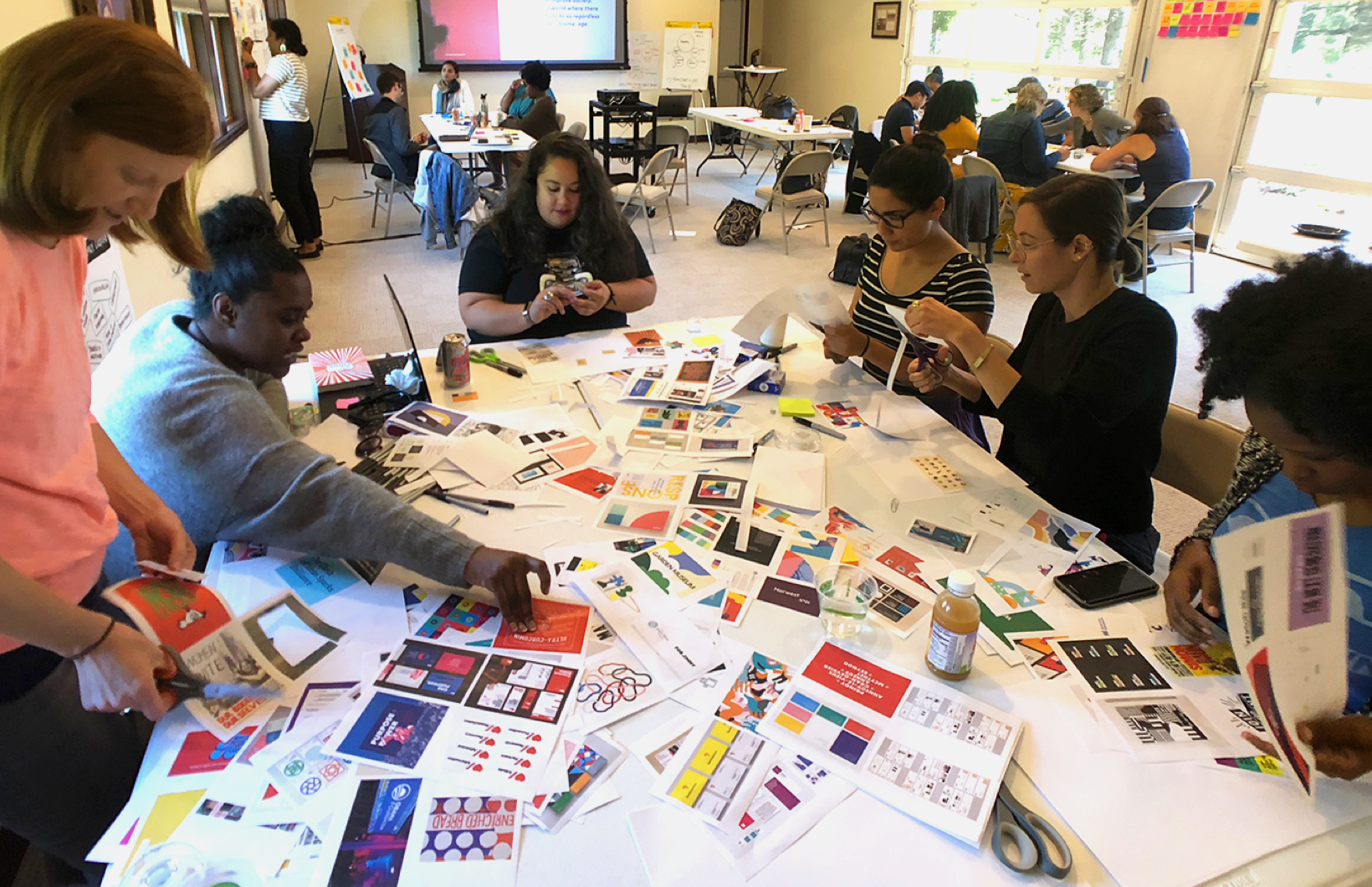
Another point of impact for our team has been in how we approach and structure the timeline for visual identity work. A visual identity is much more than a new logo or color palette; it is the outward expression of an organization’s mission, vision, values, and culture. And in our experience, engaging in a co-creative process to design a new visual identity can create big shifts in how an organization thinks about itself.
It was critical to create intentional time and space for our client team and their stakeholders to reflect on the different visual identity directions outside of our shared critiques. It was also valuable for us to provide guidance on how our client team could gather and synthesize additional feedback to make thoughtful, creative decisions. In future visual identity work, we will continue to create intentional spaces and thoughtful structures for this kind of reflection, and creative decision-making or consensus-building.
Stewarding projects from strategy to solutions
Some GGS projects focus solely on design strategy: what is the right problem to solve? Others focus more on design solutions: how should we solve it? Our work with GARE was a rare opportunity to do both, and to prove out one of our longstanding theories: that great strategy leads to great solutions.
By starting with exploratory research, we were able to define a strategy for the evolution of GARE’s online experience that merged their internal strategic planning work with the most relevant and timely needs of their members. These insights formed the foundation for the portal, website, and visual identity work that followed, and ensured that all of the solutions we designed would add up to a cohesive whole.

Greater Good marries the best of iterative and creative design processes with a thorough, and adaptable project management style. I appreciated how Greater Good Studio adapted to our need to further engage our membership network in the visual identity re-design process, while also holding the container and balance of project interdependencies, allowing us to stay within project scope and right relationship with our network.
Nadia Mohamed
This project gives us renewed confidence in our theory. It’s a good reminder that we should always include strategic foresight at the start of design solution projects. And that, whenever possible, we should end our design strategy projects with tangible deliverables that support our clients as they move toward implementation.


